
Going further with a new look!
Today, we reveal something that’s been brewing behind the scenes for some time, and we’re pretty excited about it. Introducing a new look and feel for 2C2P.
But why the change, you ask?
This is not change for change’s sake.
This is much bigger than an aesthetic overhaul - it reflects a clear evolution in what we do and the vision which we are looking to achieve.
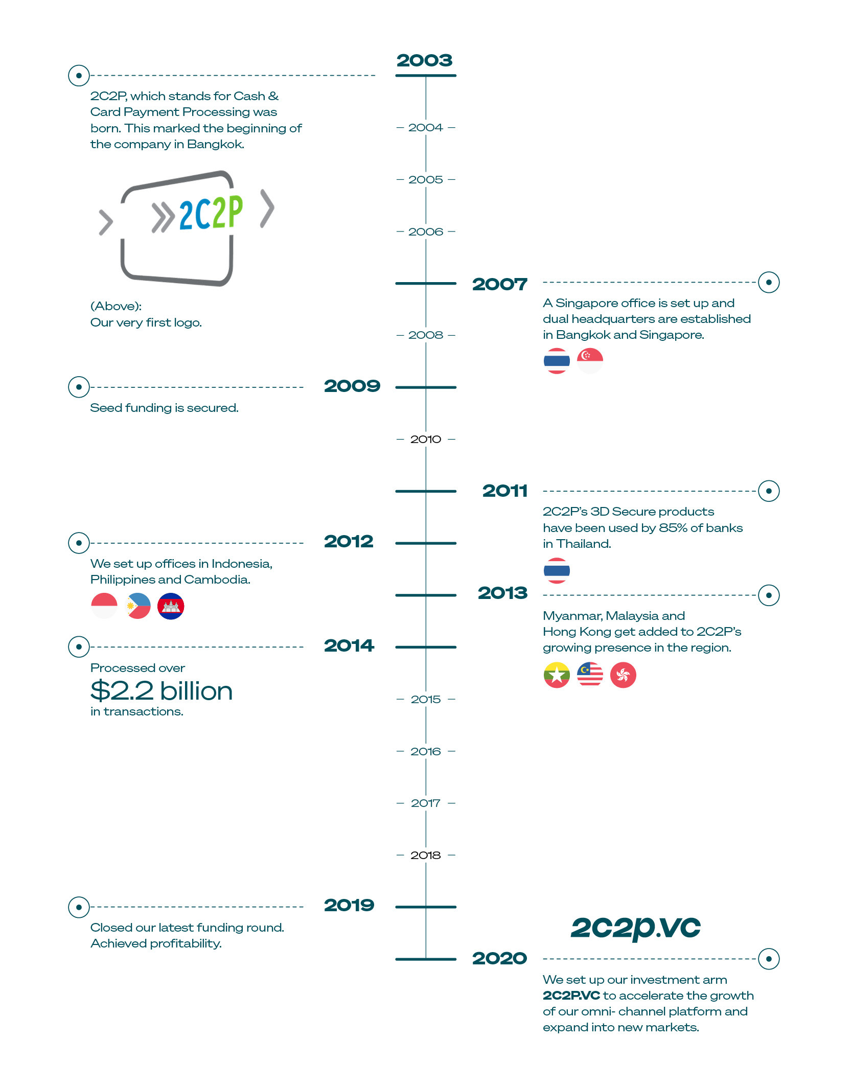
Let’s go back to the start
The year was 2003. The idea of broadband was just gaining traction. People were still listening to music on CDs and shopping in real, physical stores. Paying for goods over the Internet seemed like a utopian reality. Card schemes announced their first payment security protocol called 3D Secure led by Visa. 2C2P was among the first few companies to be certified by all card schemes.
That was the beginning of 2C2P.
Putting our best foot forward for tomorrow
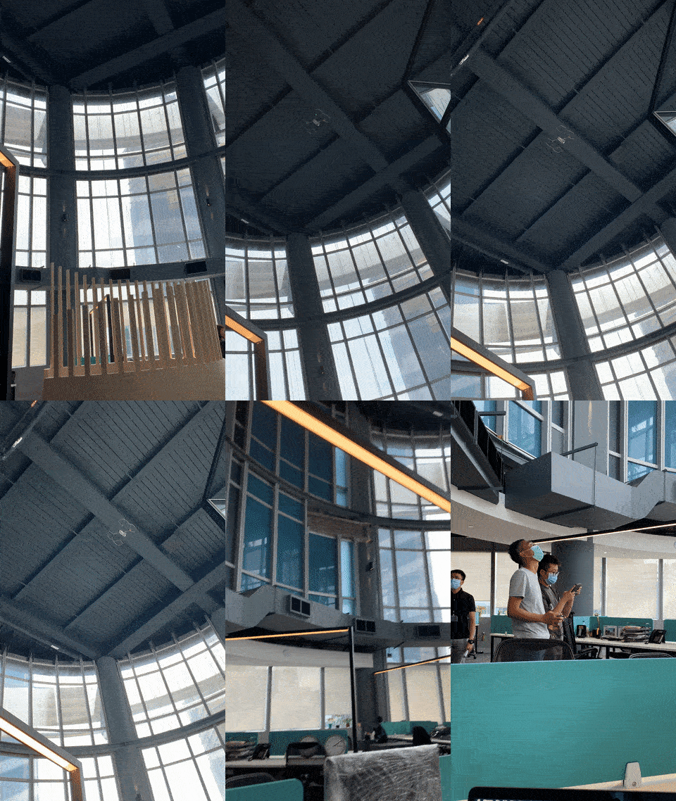
This year, our Singapore headquarters have levelled up with us - from a shophouse to a skyscraper in the heart of the financial district. We’re even able to comfortably fly a drone in our new space!



Better views aside, the core philosophy of 2C2P has always stayed the same. To help ambitious businesses operate seamlessly by leveraging our comprehensive range of omnichannel payment services.
Since 2003, we have been empowering the growth of businesses in Southeast Asia, from the region’s most popular online marketplaces, insurers, tech giants to your favourite fashion brands. We help them accept payments from millions of customers globally.
What’s next?
We will continue to carry the torch. Going further to help our clients succeed in this ever-evolving complex payments space.
We're ready to take them beyond what they believed possible.
There are no boundaries to our customers’ ambition.
And there are no limits to where we can take them.
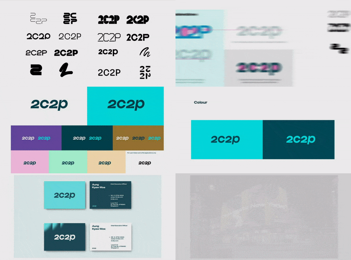

As we continue to grow and scale beyond Southeast Asia, the new logo and colours represent those ambitions.
The colours we have chosen are fresh, bright and contemporary, and meant to invoke actions and progress.
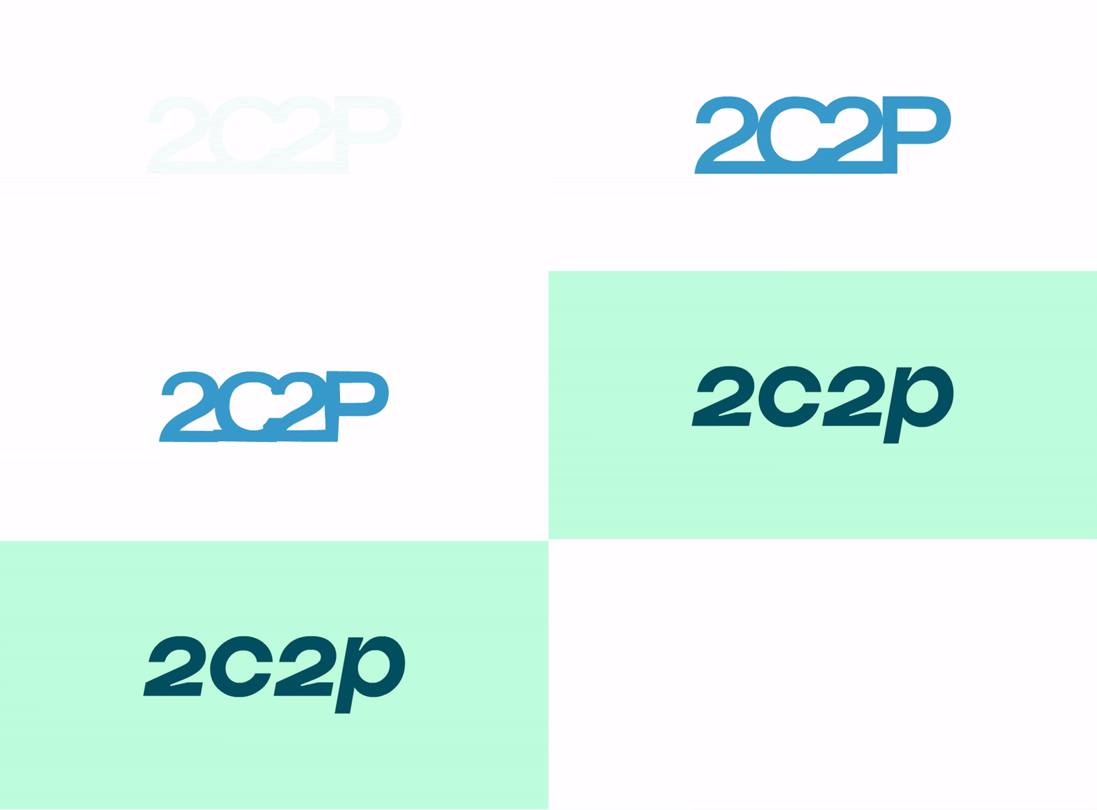
The logo is designed to be cleaner and sleeker. Its right-leaning typeface further illustrates our continuous desire to drive change and progress.

This is not change for change’s sake.
This is not change for change’s sake.
It signifies our commitment to an exciting next chapter, and we hope you’ll come along for the ride.
